By Using a Font Freely, There is More Room to Focus on Creativity
The guidelines for using a font differ from company to company, and with things becoming more complicated in Japan, there are many cases of this causing problems during anime production.
Mihara:“One of these is who is responsible for the reuse fee for the font. Is it the studio’s responsibility for using the font, or is it the TV station or the company selling the DVD? For example, an editing company that prints the type unknowingly uses a font and it is put on a product, and then afterwards the font producer requests a hefty usage fee to the anime production company... I’ve heard of cases like this happening.”
Shibata:“We wanted to build an environment where something like that doesn’t become a barrier. We released the digital font product LETS with a yearly license in ‘02, ahead of other companies.”
Mihara:“There isn’t a first time or second time in terms of font usage. As a company specializing in digital, that’s our way of looking at it. With LETS, someone can use all of the offered fonts as much as they want within the license period. Furthermore, we don’t charge a reuse fee for any products made during that time that are re-released on something like a DVD. We also clearly lay out with circles and Xs in our catalogues different usage scenarios in our guidelines. Similar products have been released by other companies, but we’re still the only ones who have made the rules this clear.”
Shibata:“America adapted DTP earlier than Japan, and this type of practice has been well-established for awhile. Our LETS system references this type of overseas practice while being built based on the situation in Japan. Fonts are primarily a product that you sell once and that’s it. Thinking about how many designers there are in the world, I could tell that that sort of business model had plateaued during the ‘90s. Also, since the software is expensive, not all designers can necessarily use a wide variety of fonts. It’s a source of stress for the people requesting the design as well. When we were developing it, we called it the ‘colored pencil concept.’ A box of 32 colored pencils allows you to expand an image better than a box of 8.”
Mihara:“Fonts are something that come to have meaning through use. By letting people use a lot of fonts stress-free, we allow them to focus more on their creativity.”
Shibata:“It’s the same for us. The reason a lot of producers charge a reuse fee is because they need money to develop new fonts. Our company currently produces over 20,000 characters for a single Japanese font, and on average, it takes about a year and a half to develop. Depending on the font, some can take even longer. But if we predict some of our profits through renewed licenses, we can come up with a budget and have a steady supply of new fonts.”
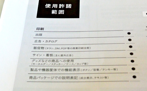
The scope of acceptable usages under the LETS license is clearly explained in the catalogue.
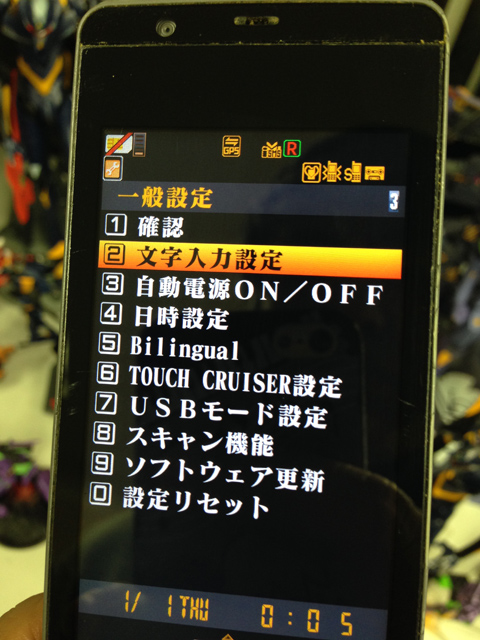
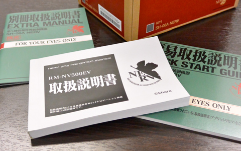
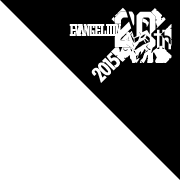
This thorough Eva cell phone from Docomo had Matisse EB installed as the screen display font. The use of Matisse EB was extensive, including a variety of small places like the user manual.
Column
-
05
-
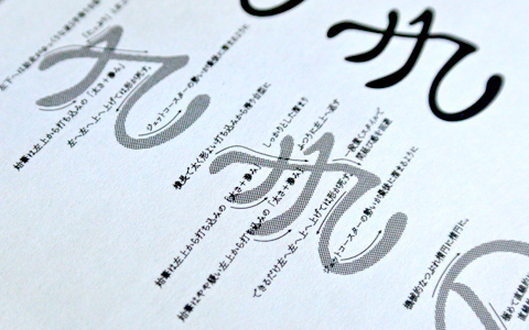 To design a single hiragana font takes on average a year and a half. Several production supervisors together produce over 20,000 characters step by step, taking months on a single character. What takes the longest time in the design process is designing the hiragana, which most easily shows the font’s character. The photo shows a diagram used to explain the special characteristics of the kana design for the font Chikushi Antique S Mincho L at a seminar offered by the company. With descriptions like “like the force of a rollercoaster piling up at the end,” the expressive and interesting explanations go into each and every detail.
-