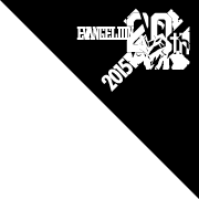
“A.D. 2015” --
A bold Ming typeface on a black background. It was text, and not an image, that was chosen to signal the start of an epic story in a single frame of the first episode of the anime TV series Neon Genesis Evangelion. The text design, used in the episode titles and various details throughout the show, burned its way into the minds of the viewers, and continues to be seen as one symbolic representation of the series. Route 2015 is a new series that puts the focus on people outside the major anime players who have a deep link and connection to Eva, and the first installment brings you the story of the people of the font producer that released the Ming typeface Matisse.
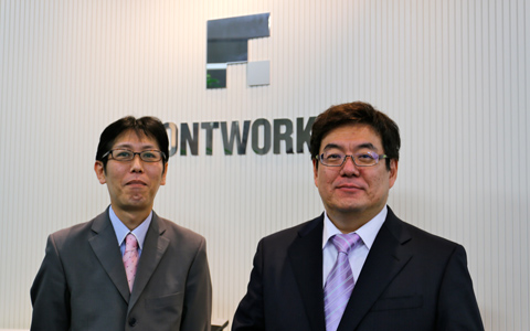
(Left)
LETS Project Marketing Headquarters
Deputy Director
Shiro Mihara
Joined Fontworks in ‘00 after working for a DTP shop. Involved in the support and operations related to all digital content for industries such as broadcasting and video games.
(Right)
Executive Officer
Head of the LETS Project R&D Headquarters
Kazuhiko Shibata
Founded Fontworks Japan (now Fontworks) in ‘93. Involved in the development of fonts and utilities, such as the LETS year-long license font products.
A bold, modern Ming typeface - The birth of “Matisse”
Fontworks was founded in 1993 in Fukuoka Prefecture. The company grew to become number two in the global market share as a producer of digital fonts, and the first Ming font it sent out into the world happened to be the “Matisse” font, also known as “Eva Ming.” Kazuhiko Shibata, founder and current executive officer of the company, was there for its development.
Shibata:“Matisse is a typeface that designer and founding member of our company Toshiyasu Sato oversaw the development of. When our company was founded, it was the dawn of desktop publishing on Macs. Up until that point, all text was printed using an analog method known as phototypesetting, but it was becoming a time when you could do everything on a Mac 1. But the amount of characters in Japanese far exceeds that of English, and typesetting needs to strike a fine balance between kanji and hiragana. Developing fonts takes an enormous amount of time, so even the long-standing phototypesetting companies couldn’t enter the DTP world right away.”
There was a very limited number of Japanese fonts available in the first half of the ‘90s, when Japan’s designers were beginning to implement DTP.
Shibata:“For Ming typefaces, Mac users had Ryumin by Morisawa, who had moved to digital from the phototypesetting world. For Windows users, Ko’s MS Mincho was very familiar. However, when we were starting the company, we were anticipating DTP becoming commonplace and we felt that there was a need for something else beyond those two. For example, Ryumin has an old style, but Matisse has a design that is close to a modern style. A contemporary style that still includes some old... is probably accurate. There was a time when a modern style of type was popular in the phototypesetting world as well. But when DTP was beginning, anything with that kind of flavor was completely missing from Japanese fonts.”
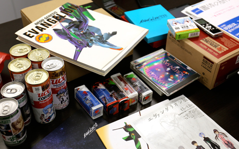
Evangelion-related goods brought along on the day of the interview. Almost all of them were their own personal items.
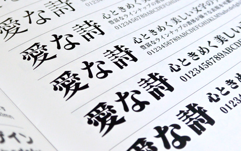
A photograph of the part of the catalogue showing variations of the Matisse typeface used in
Neon Genesis Evangelion (from the company catalogue).Column
-
01
- What is phototypesetting?
-
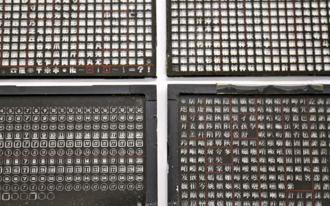 It was method of setting type that was used for printed material before the emergence of desktop publishing on the Mac. Using a photographic process, a light was shown on a glass plate such as these and the shutter was pressed and each individual character would be burnt into the printing paper spread beneath the plate. The size of the characters could be changed by changing the lens, and each project took skill and technical sense.
-
02
- What is DTP?
- Short for desktop publishing, it’s a type of publishing in which the manuscript, design layout and editing of the material to be published is done on a computer and that data is sent to a printer. With the introduction of DTP, printed material could now be produced using a single office computer, and the technology began to become commonplace in Japan during the early ‘90s. However, compared to Western alphabets, a single Japanese font takes a lot of space, and the numer of fonts that could be used early on was limited.