
Passionate Anime Fans Discover Matisse
Each week, L-shaped text on the episode title screen would capture the attention of the fans watching Eva. Director Hideaki Anno stated that this was an homage to the technique of director Kon Ichikawa. For example, in the crew credits at the beginning of Ichikawa’s film The Inugamis, Ichikawa himself played with the typeface and devised the layout, and the dynamic use of text alone was enough to bring the viewer into the story. It’s well-known that for several years following the success of Eva, a number of commercials, ads and dramas began consciously using a bold Ming typeface design.
Mihara:“In order to show text in their anime how they truly wanted it, director Anno took on a new technique where he used DTP to do everything himself. He was a trailblazer in that.”
Shibata:“For us as well, it was a new phenomenon to have an anime be the reason for a font to sell, and it was interesting. Fonts are something designers use, so they don’t usually have that kind of spike in sales.”
Where can you buy the Eva Ming font? Many of the people buying Matisse EB following the TV broadcast were passionate fans who were familiar with DTP environments through doujinshi.
Shibata:“Of course, the then unknown Fontworks Matisse wasn’t credited anywhere, and the software was expensive so it wasn’t sold in stores. Still, during a time when the Internet wasn’t widely used, the fans actively researched it and sought out our product. Originally, it was difficult for a new company like us to compete in the print industry with major companies who had been around since the time of movable type and phototypesetting. Around then, we were putting our efforts into doing business with game companies. It was right around then that a new generation of systems were coming out, like the Sega Saturn.”
Mihara:“With Matisse, our name became known more and more among anime production companies as well, and after Eva, director Katsuhiro Otomo’s ‘04 film Steamboy was the next to use it. That was the first time our name was listed in the end credits.”
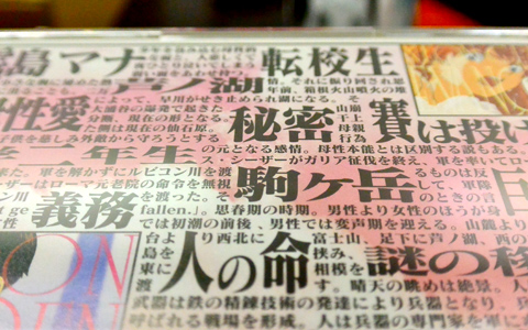
The back of the packaging for the Gainax video game release Girlfriend of Steel. Using Matisse, the design highlighted keywords by placing emphasis on different text and sparked the imagination of fans.
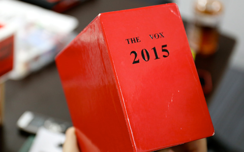
This previously sold DVD box set of the TV series is Mr. Shibata’s personal copy. Written on it is the word “2015.”