The Sudden Success of Matisse EB
We didn’t know why at first
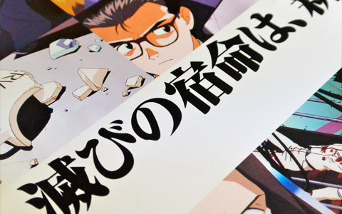
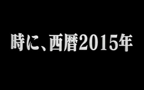
With a soft refinement that seemed to find a middle ground between digital and analog, the Ming typeface Matisse was released in ‘92. The exact font used by the anime TV series Neon Genesis Evangelion, which came about soon after, was Matisse EB, which the company released in ‘94.
Shibata:“At the time, Gainax, who produced Eva, was using a PostScript-compatible printer called an imagesetter. At the time, this was a huge printer that ran in the tens of millions of yen [laughs], and there were probably no other anime production companies using them. But they had come up with a system early on where they could completely produce their own film even using desktop publishing on a Mac and that printer. They were using it to print materials like packaging for the video games they were making at the time. But there were very few standard bundled Japanese fonts with it. The fonts were just included directly in the hardware and any additional fonts needed to be installed.
“The format wasn’t in place. On the other hand, our company was the first producer in Japan to release a font package that could be installed on a PostScript printer. Basically, if you wanted to add a font, you had to use our product. That’s how it all started.”
Also joining our conversation was Fontworks’ close tie with the anime world, Shiro Mihara, who entered the company in ‘00. In ‘95, he was watching Eva as a simple fan.
Mihara:“I don’t think there was even the thought of an anime production company printing text at the time. Text that appeared in the animation were ‘pictures’ drawn by hand by a background company, and even the opening and ending credits were done by an editing company. Because of that, an anime production company even wanting a DTP font at the time would have been rare.”
Shibata:“On top of that, we were also in Hakata and we were sold out of our stock [laughs]. But a bit later, Matisse suddenly began to sell. In particular, we received 3-4 times as many orders as normal for EB. At that time, fonts were tens of thousands to a hundred thousand yen. I wondered why, and an acquaintance in Tokyo said, ‘Could it be Evangelion?’ [laughs] I myself had been a fan of anime and tokusatsu since a long time ago, so I was watching it air every week. But that was the beginning of the Internet. To be honest, we couldn’t have predicted how big Eva would be.”
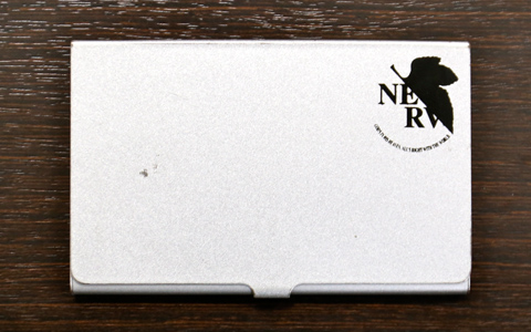
Mr. Mihara’s business card case. It was purchased in ‘97 at a theater showing Neon Genesis Evangelion: Death & Rebirth.
The previous theatrical title and theater pamphlet photographed above used an older-style typeface than EB, Matisse UB.
Column
-
03
- Why was Matisse EB used?
-
 Before Eva aired, Gainax was seeking a new Ming font that could be installed on their imagesetter. Hearing about this from an imagesetter distributor, Fontworks approached the company with a catalogue of their products. Little did they know that one of the typefaces in the catalogue at that time would later be used in Neon Genesis Evangelion. Mr. Shibata heard later that it was director Hideaki Anno himself who chose Matisse EB.
-
04
- Future of Matisse EB
-
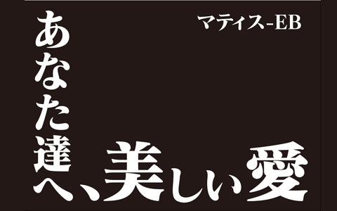
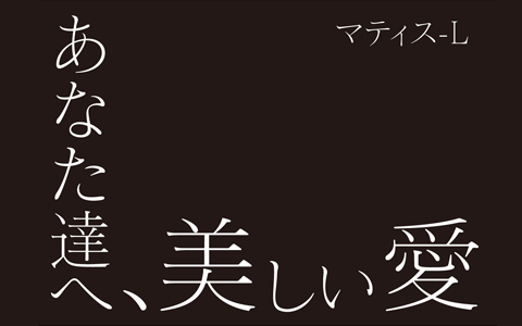 Matisse EB has a bold style with a lot of character that brings to mind a brush and ink. Despite being digital, it’s a typeface with individuality that combines the softness of its edges with an impactful strength. EB even has more of an impact than the other Matisse font, L, and is known for having a unique feel.